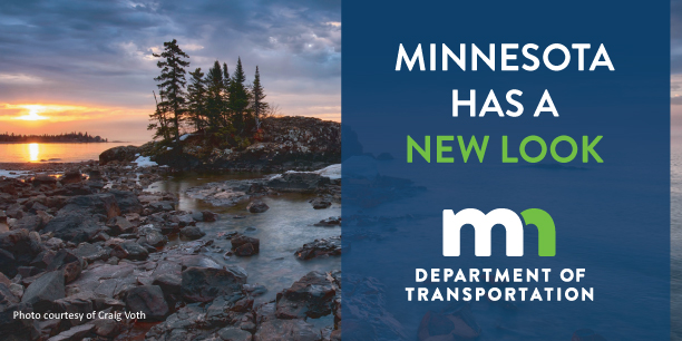
MnDOT launched its new logo Dec. 12, 2016, the first significant change to the agency's look in 40 years. The new logo is part of an initiative uniting all state agencies under one brand to show that state government works together to make life better for all Minnesotans. |
By Kevin Gutknecht, Communications director
Today is an historic and exciting moment at MnDOT as we debut a new logo for the agency. You will notice the new logo first on our website and our social media accounts.
The round logo with the pine tree and the North Star has been part of MnDOT’s identity for more than 30 years. And that logo has served us well. Minnesotans are familiar with MnDOT because of that logo on our vehicles, truck stations and other buildings, on the camera shots of traffic on morning news programs and, until recently, on the state map.
Why is a logo important? A logo is a symbol that is part of an organization’s brand. The brand is the promise that an organization makes to its customers regarding products and services. And the brand includes the attitudes and opinions that the customers have when they see symbols of the brand, such as the logo.
MnDOT’s new logo is part of an ongoing rebranding effort by the state of Minnesota. As one of the state’s largest agencies, MnDOT is proud to lead and be one of the first agencies to incorporate the new state logo. Every day, our work at MnDOT contributes in a significant way to the state’s ongoing promise to the public--that state government’s parts, or agencies, work together to make life better for all Minnesotans with a seamless, trustworthy, user-focused experience for all its citizens and consumers. And our desire, not only at MnDOT but across the entire enterprise, is that people’s attitudes and opinions about state government will include trust and confidence in the state and the services we provide.
Historically, as state government evolved and new agencies were formed, each agency adopted its own brand and logo. The end result is that, now, state government is considered by many to be a disparate set of agencies that each serve a subset of the public. The "M and N" in the new logo reflects the state as a whole, and the text attached describes the specific agency. This is a unified state brand. And we use this new logo to show that unity.
Using a unified brand presence across our state agencies will help inform citizens about the variety of services provided by state government. Research has shown that Minnesotans are very familiar with the logos of Target, 3M and the University of Minnesota. But they are unaware of what logos or identities most state agencies have. This streamlined multi-agency approach seeks to change that – to better inform Minnesota’s residents, visitors and business partners of the wide variety of services our state agencies provide to our communities across the state.
The next step will be to leverage our brand to promote the state of Minnesota as a great place to work. Like many employers, the state of Minnesota faces the challenge of an aging workforce. Minnesota Management and Budget estimates there will be around 1,000 retirements per year in the coming years from state government. The wave of retirements has focused the enterprise on workforce planning and recruitment best practices to ensure we attract, train and retain the next generation of 21st century workers and a workforce that is inclusive and reflects the diversity of the people we serve. A brand that is inclusive of all Minnesotans will help us do that by presenting a fresh and cohesive image to potential state employees.
You may have already seen the updated state logo as you engage professionally and personally with agencies outside of MnDOT. Explore Minnesota has been using it as it promotes Minnesota as a great place to visit since 2013 and it has been an integral part of the state of Minnesota’s career recruitment materials. You may have been one of the 4,000 attendees at the state of Minnesota’s first ever career fair in October who encountered the updated Minnesota logo at various agency booths and displays. It has also been on the state highway map since the last printing in 2015. The intent is that all state agencies will change to the new brand by July 1, 2017.
There is certainly some cost associated with making this kind of change. However, for MnDOT, it should be relatively minimal. The changes you see today on the website and social media were done by MnDOT’s Office of Communications and others who on a daily basis work on our website. We did not use consultants for this work, and much of the artwork was done by MN.IT.
For MnDOT, we will update logos on vehicles and materials through attrition. So, for a time, we will see new logos and old logos on trucks and truck station signs. When it is time to change a sign or trade in a vehicle, we will change the logo then. The same goes for stationery and business cards. Use up the ones you have on hand, and when you order new material, it will have the new logo.
A change such as this can be a challenge but it is also the beginning of a new and important era at the agency as we continue to plan for the state’s growing demands for transportation and transit in every region across our great state.
|